Freitag, 19. April 2013

Choreology

Raimar Heber, head of the dpa-infografik graphic design department organises a monthly get together of Graphic Designers, Illustrators and other visually communicating folks in Berlin, choosing from a broad range of topics that mainly focus on different approaches of visual communication.

Yesterday we were introduced to Tatjana Thierbach, who is one of the few professional practitioners of the Benesh Movement Notation system in Germany.

Coming from the classical ballett movement notation is used in many diferent instances where the communication of complex movements with others or to pass choreographies on to later generations is used.
Younger than other notation systems the first known attempts to write down movements date back to the court of Louis XIV, le Roi Soleil.
 It is mainly used to help the choreographer in classical ballet. Other fields are as well in filmmaking and also as a helpful tool for physiotherapists, where the langauge developped it's very own complex forms.

 Tatjana studied at John Cranko's Ballet school in Stuttgart where she met Uwe Scholz, who was very much influenced by John Cranko.
Cranko relied very much on the Benesh Notation System, which inflamed Scholz to use it for his choreographies as well. Tatjana decided to study the system and became a close assistant to Scholz and after his untimely passing away an important preserver of his cultural heritage.

The Notation system itself equals the classical notation system with five staves and barlines.
You can find free introductory videos to the system online on dancewrite.com.


We gathered at the lovely Café Blume, close to Volkspark Hasenheide in Neukölln.
The Café is run by Tatjana and her partner, who is touring with Andrew Lloyd Webber's Cats, based on the idea to fill a gap they faced with their kids and to develop a family friendly Café with a playing area for kids close to the park.


Lovely place, wonderful people and a great evening.

Thanks a lot, Tatjana and Raimar for arranging this truly enchanting event!


Dienstag, 9. April 2013

An interview with Rien Poortvliet

A couple of days ago my friend Christoph Heuer  sent me a link to this video featuring an interview with the famous dutch animal and landscape painter
Rien Poortvliet.


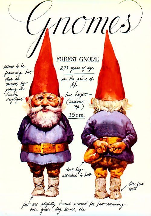
Most known for his scientific take on "Gnomes" his work encompasses as well books on the dutch history, hunt, horses and wildlife.


Most of his books have the characteristics of an explorers diary, with a sketchy loose approach.


There is an elaborate post on Poortvliet and his work featuring the video on Armand Carbrera's blog "Art and influence"


Montag, 8. April 2013

Warriors and Warlords

Today I received my copy of Angus McBride's "Warriors and Warlords"


Which completely blew me away.
It does not only feature McBride's outstanding illustrations for Osprey publishing but the foreword comes also with excerpts from elaborate interviews that Martin Windrow conducted with him.

There are a couple of great insights to his painting technique and his process (the main body of his work is done in gouache) as well as on the business side of the life of an illustrator.

I can warmly recommend to go for that book!


The interview closes with some words of wisdom for the aspiring artist, which I found very helpful for me:

"let's just say: there is no substitute for lifedrawing classes. They may be 'detrimental to the free flow of inspiration...' - but unless students are actually taught how to draw, God knows how the poor little devils ever expect to make a living. (...)
You have to learn thoroughly the basic mechanics of reproduction and publishing. You have to learn how to meet a deadline. And perhaps, most of all, you have to be a kind of frustrated teacher, always itching to pass things on, to share them and make them plainer - because in the long run, that's what illustration is for.
In the end I can't say much more than, find a subject that genuinely excites you, illustrate it as well as you can, and show your work to every agent and publisher you can track down. And, of course, you have to accept that the learning process is going to last for the rest of your life."

Angus McBride

Sonntag, 7. April 2013

cheapest way to get a glass palette

If you're working in oils you will want to have a decent palette.

I was thinking of how to build a glass palette (which is easy to clean, plus you can put a neutral gray background behind it; which is helpful to see the true colours without them being altered by the wooden colour or white of a handheld palette) for my taboret until I found this extremely helpfull website about the selfmade classical atelier at home by illustrator Björn Gschwendtner .

The solution is facepalmingly simple, logical and ingenious:
buy a simple frame for pictures, put a gray cardboard or whatever colour you work with to tone your panels or canvasses as a background and there you go:


:-)

Samstag, 6. April 2013

Raven

The first kickstarter campaign I ever supported was Paula Cole's album project "Raven".

Yesterday I downloaded the album and I love it through and through.
It was as well Paula Cole's birthday.
(Happy belated birthday!!)
The sound and the songs of the album are brilliant, she's weaving her songs and themes with wonderfully earthy colours.

Here's a watercolour that I did last year, wondering what a cover for the album could look like:


You can listen to some excerpts of the album on Paula Cole's Webside.


Donnerstag, 4. April 2013

Collecting colours

If you're riding on a train or don't have enough time to do an elaborate study of a scene, there's still a fun thing one can do: fetching the colours of your view in small patches.
Over the time you can thus gather a whole library of colour mixtures that you can later use in final works.

This collection of patches came from my view out of the train, while driving back to Berlin.

The scenery was pretty clear with a bit of dusk above the horizon, open fields were changing with small patches of forests.


I found that hint in Felix Scheinberger's "Wasserfarben für Gestalter" ("water colours for designers")

Mittwoch, 3. April 2013

sketchbook pages from Cologne

Back from my visit in Cologne, where I met with long not seen friends and family.
We had a great time.

Here are some of the sketchbookpages from our visit:


Sonntag, 24. März 2013

Kai is reading

My son Kai learns how to read.

I'm always in awe when I see my kids manage to learn a new task and that everything that we are able to do today and oftimes are tending to take for granted was difficult and only through diligence to achieve once.

To me the attitude of a learning child, open, curious and persistend in it's continuous striving is the most inspiring one.


Samstag, 23. März 2013

the Making of "Mysteries of Miskatonic University", part 2

Building a tableau


In today's post I want to show you a bit more of the process of the painting "Mysteries of Miskatonic University".
In the first part I told a bit about materials and inspiration I gathered, out of time and organisational reasons most of them are photoreferences.
In my point of view photoreferences are an absolut legitimate support for your final painting but they do come with certain challenges.
Firstly they are already translation from the threedimonsional space into a twodimensional picture which limits the information we can gather from them.
And secondly most photographies do as well limit the value range by clipping in the highlights and shadows.
What I did to deal with those challenges was firstly to make a little tableau, a small modelkit of my compositional sketch.
This practice has already been in use mainly by painters of historical or mythological scenes in the 19th century:


I start out to build a model of my main character:


Errmm...wrong picture:


I built a rough model out of mash wire and  tecclay and lit it:


Here is another picture from a later stage where I used additional reference material for the gun. In the background you can see that I also used a small globe that has a small bulb inside to get a notion of how the bluish moonlight falls onto the main character's shoulder:


I then did a black and white drawing on my board and an underlying tonal painting (in acrylics, I used raw umber on this one).


After that I painted a smaller sized poster study, a rough version of the painting, to explore color range and tones I want to use in the final piece:


Here you can also see my set up while I'm working. On the right hand side I have my computer, I usually load all my photoreference into one Photoshop file on different layers. Far left is a small taboret with brushes, water reservoir (on this painting I used water soluble oil colors) and next to that the tableau.

During the process of painting I didn't do any photographs (sorry, it consumed my whole attention :-)): I worked from area to area, starting out with the face:


This is the final piece:


For the figure of Siobhain McCorkindale I also used the principles of shapewelding and as well the windmill principle to help her better blend into the picture.

Main painting references for this painting were

James Gurney's Imaginative realism

and as well the tutorial videos by Scott Waddell, especially "the Art of painting" and the extended version of Webisode 7

I hope you enjoyed that little trip through this painting process and could draw something for you from it.

Tomorrow I'll be off to Cologne for a week and I'm looking forward to be sharing some impressions from there with you.


Freitag, 22. März 2013

buy one, buy two, give it to strangers...

we interrupt our Making of Feature for a brief happy anouncement:

The textbooks for my advanced artstudents arrived:


After a basic drawing course I usually start out to work on pictures with a more complex content aligning to John Howe's Fantasy Art Workshop (German: Handbuch der Fantasy Kunst).

If you follow the posts by John Howe on social networks and on his webside you will know that he sometimes anounces publications with a pretty subtle kind of promotion ;-) :

"Buy one, buy two, give it to your friends and strangers you meet on the streets."

My art workshops give me the good opportunity to  broad grinningly do so.

("always at your service!")

The German version comes as a rugged Hardcover, perfect for a often to be used studio reference and is published by Heel Verlag in Königswinter

Donnerstag, 21. März 2013

the Making of "Mysteries of Miskatonic University", part 1

Choosing a theme and collecting references

To work harder on my portfolio and find clients and publishers that suit the way I illustrate I decided to contact a professional advisor for illustrators. Through the German illustrator's organisation IO I was introduced to Mrs Karin Gruß, who has been working with illustrator's in the editorial offices of many of the important german publishers for over twenty years.

We thoroughly went through my portfolio and decided to as well add a few a more darker pictures.

A good  oportunity to play around with two themes that I wanted to explore a bit more for a longer time:
the weird fiction of H.P. Lovecraft and a bit of Steampunk.

I started out with some sketching and decided to go for a composition like this:


In the Natural historical museum in Berlin there's one big room with old compounds in glasses; floating and warped in their conserving fluid I find them most peculiar and strange and being locked in with them in a room at night seemed to be one of the most unpleasant things I could think of.
Sending our protagonist at nighttimes through a creepy old univeristy, filled with mysterious books and Grimoires and as well some of those weird species invented by Lovecraft preparated in those jugs seemed to be a fitting setting to me.
Here are some of the reference pictures I took at the Natural Historical Museum in Berlin:


*Yikes!*

Concerning the protagonist for the pictures (it's going to be a small series) I wanted to go for a female protagonist. A cunning investigator of the supernatural who is capable of dealing with fierce, extraterrestrial, ancient species.
I gave her the name of an old character a friend of mine used in the "Call of Cthulhu" roleplaying game:
Siobhain McCorkindale.

Two good Friends of mine, singer and actress Mirjam Zipf and her husband photographer Philipp Schläper liked the project, joined the fun and helped me with quickly improvised costumes with diver-goggles and an old coat:


My brother Martin got me a reference shot of himself for the old and worn out leather jacket:


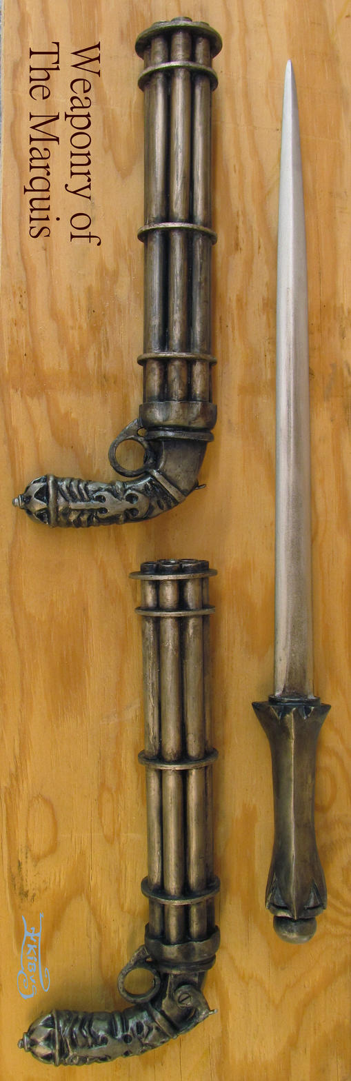
Another dear friend, Alanna Schmitt a.k.a. Inkibus who is making props and costumes helped me tremendously with the costume research and was so generous to let me use one of her props as a basis for the weapon of Siobhain McCorkindale:


A big and cordially thank you for all of your support!!!

Those were the main references. During the process of painting I added a few more, like an old sheepfur for the collar of the jacket etc.

Tomorrow I show you how I built and lit a small reference modell and the process of the painting.


Mittwoch, 20. März 2013

It is Spring.........

Er Ists

Frühling lässt sein blaues Band
Wieder flattern durch die Lüfte;
Süße, wohlbekannte Düfte
Streifen ahnungsvoll das Land.
Veilchen träumen schon,
Wollen balde kommen.
—Horch, von fern ein leiser Harfenton!
Frühling, ja du bists!
Dich habe ich vernommen!


Eduard Mörike  1829


It Is Spring
 
Spring lets her blue ribbon
Flutter in the breeze again;
Faint, familiar scents
Drift with promise o'er the land.
Already the violets lie dreaming,
Longing to unfold.
—Hark, from afar the faint sounds of a harp!
Yes, spring, it is you!
I can hear you coming!


Translation: Charles L. Cingolani 


Alas....We do have more snow than in January......

Dienstag, 19. März 2013

Everything Lovecraft, part 2

In yesterday's post I reported a bit on my experiences on the bookfair in Leipzig and how that all "mysteriously" related to the weird fiction of H.P.Lovecraft.

If all of that wouldn't be enough my brother, illustrator Martin Schlierkamp, had just finished a private comission that was based on the Cthulhu Mythos by H.P.Lovecraft.

"Curse of the dreaming God"


Martin is so generous to share parts of his process:

This is the layout (drawn in pencil on paper) that was accepted by the client:


This is the final black and white drawing that served as a basis for the painting.


Here's a small collage of different working steps:


(From left to right) At the beginning he's priming a mdf board with gesso, than he's drawing in a black and white preparatory drawing with strong contrasts. He's laying in the colors with an airbrush and then starts out to work in the details with colored pencils.

One of Martin's favourite techniques is most popular in the poster art of Drew Struzan

In his video tutorial "conceiving and creating the hellboy Movie Poster Art" he's elaborately explaining his different working steps.


A thousand thanks, Martin!

In some of the following posts I'll also share a making of for the "Miskatonic"-painting.


Montag, 18. März 2013

Everything Lovecraft, part 1....

 One question I oftimes ask myself is whether we do have the choice to avoid magical thinking at all and whether this would be a desirable state of being.
It would definetely deprive us from a lot of magic and mystery, a throughout questionable loss, but in some cases it may as well hinder us from drowning into  insanity....

Since last November I was preparing a couple of motives for bigger works based on the weird fiction of Howard Phillips Lovecraft and his Cthulhu Mythos, amalgamated with a bunch of steampunkish elements which I thought would make a very interesting mix in preparation of the bookfair in Leipzig.

I was delighted that one of my most favourite Fantasy Art contests on the web John Howe's "theme of the month" was featuring a Lovecraftian theme for March.

How lucky I was! Perfect timing to prepare and paint a portfolio piece, let a postcard being printed of it and post it to John's website.

Here it is:


 "Mysteries of Miskatonic University": Investigator of the supernatural and Airfleet Captain Siobhain McCorkindale discovering dark secrets at the (imaginative) Miskatonic University.

Everything went right on time: Postcards received, picture posted, Portfolio prepaired.
And off I go, to the bookfair in Leipzig on the 15th of March, the anniversairy of the death of H.P.Lovecraft

I came late for an interview with comicbook artist Reinhard Kleist and had enough time to do a five minute sketch of him which he signed for me:


Reinhard is a groundbreaking artist who helped paving the way for german Graphic Novels. I remember that I was literally (but positively) shocked when his first Graphic Novel was published which was based on....Lovecraft.


Later I was thrilled to meet two of my heroes of the German Fantasy and Science Fiction scene: Dieter Winkler and Wolfgang Hohlbein, celebrating the 30th jubilee of Hohlbein's career as writer of bestsellers and the 15th anniversairy of their dark-fantasy saga "Die Chronik der Unsterblichen" ("chronicle of the imortals").


 Hohlbein's fiction encompasses a wide range of themes ranging from Fantasy stories for young readers via high Fantasy, horror but as well adventure stories among others the six official german language Indiana Jones novels and as well a series that was originally published as dime novels called "the Warlock of Salem" which was based on...yes! Lovecraft's Cthulhu Mythos. Lovecraft himself appears in the stories as the mysterious H.P.


 He wrote as well three novels that depict the adventures of the decendant of the warlock Robert Graven in "Der Magier", the magician.

 
 At the time the books came out I had already totally fallen for Hohlbein's novels and one year before, in 1991, John Howe's Tolkien calendar had strengthened my will to try something I had never dared before with watercolours:

To illustrate one of the stories I read.
I was 16 years old and had already experimented with watercolours. Fantasy pictures and drawings of extinct animals were my favourite themes and I had done one illustration for a poem by Walter de la Mare, "the Listeners". Now I wanted to try to depict a whole story and thus I painted:


"Der Fluch des Wissenden" - "The curse of the knowing" of which I brought a print to the anniversairy celebration and gave it to Mr Hohlbein, as a thank you for all these years of inspiration!

Thank you and congratulations, Wolfgang Hohlbein and all the best for the next at least 30 years of writing!!

To me that was definetely the highlight of the day, but if you think that was all of the weird coincidences around H.P.Lovecraft on the bookfair and in this weird March  2013....you are wrong...

Listen to how the story continues tomorrow...weird and mysterious....